LAST UPDATED
Saturday, May 24, 2025, 7:25 PM UTC +7 (Jakarta)
INTRODUCTION
KALCare adalah aplikasi kesehatan online dari KALBE yang menghadirkan produk berkualitas terbaik dari berbagai merek terpercaya untuk memenuhi kebutuhan konsumen.
Di masa post-pandemic yang masih mengkhawatirkan ini, sebagian pengguna memerlukan layanan kesehatan yang dapat menyediakan kebutuhan obat-obatan dan multivitamin, semudah jangkauan jari. Kepopuleran KALCare juga masih tergolong baru dibandingkan kompetitornya seperti Halodoc, SehatQ yang sudah ramai digunakan sebelumnya.
Ketika belajar UI/UX Design di Purwadhika, ini adalah project case study pertama yang ditugaskan kepada saya. Saya diminta mengidentifikasi masalah pada alur pembelian produk, alur pendaftaran akun didalam aplikasi.
Research Process
I will explain my design process and thought process. Because this is a bootcamp project, the PRD isn’t based on a real business problem and may have been generated by ChatGPT.
I followed the Design Thinking process, starting with research as the very first step.
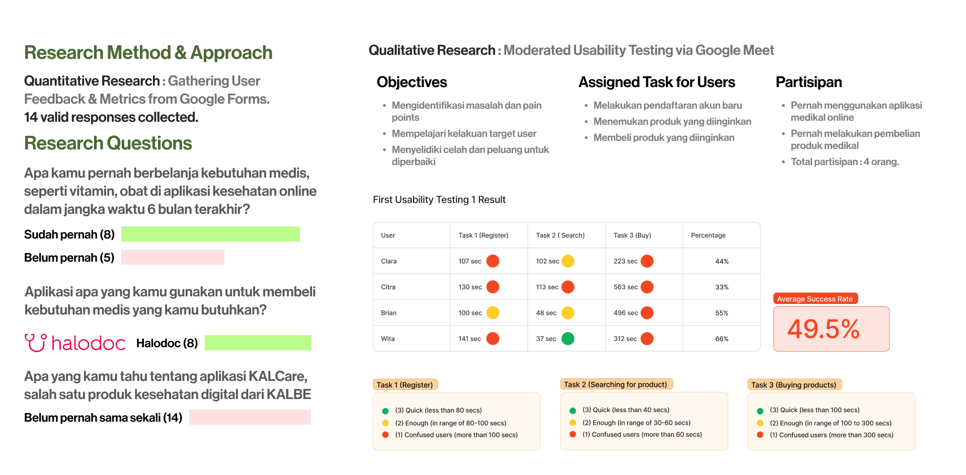
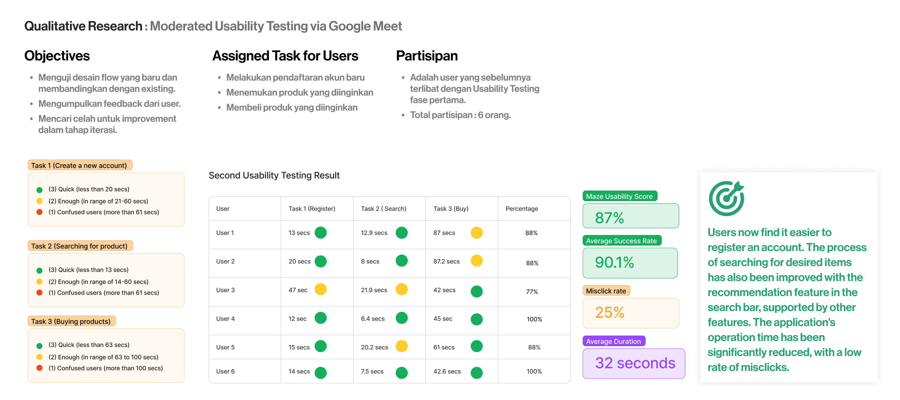
Gather related data from user feedback, through questionnaire and Usability Test.
User Research Interview
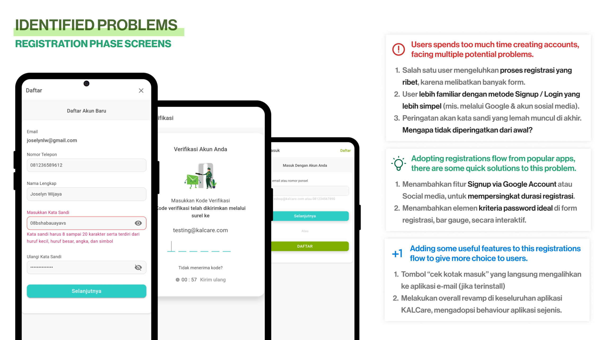
During the interview conducted via Google Meet, I noticed several struggles that users experienced when performing certain actions, such as registering an account, searching for products, and making payments. These issues became the pain points to address in the next phase.
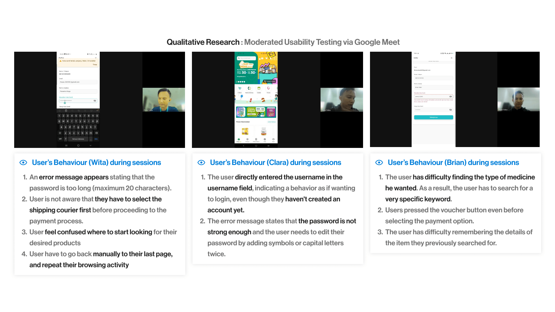
Gather related data from user feedback, through questionnaire and Usability Test.
Exploring Ideas to Tackle the Problems
During the interview conducted via Google Meet, I noticed several struggles that users experienced when performing certain actions, such as registering an account, searching for products, and making payments. These issues became the pain points to address in the next phase.
User Persona Creation
I created a fictional persona to better predict the future behaviors of potential KALCare users. This persona was designed to reflect the characteristics, needs, and challenges that these users might face. By doing so, I could tailor the design solutions more effectively
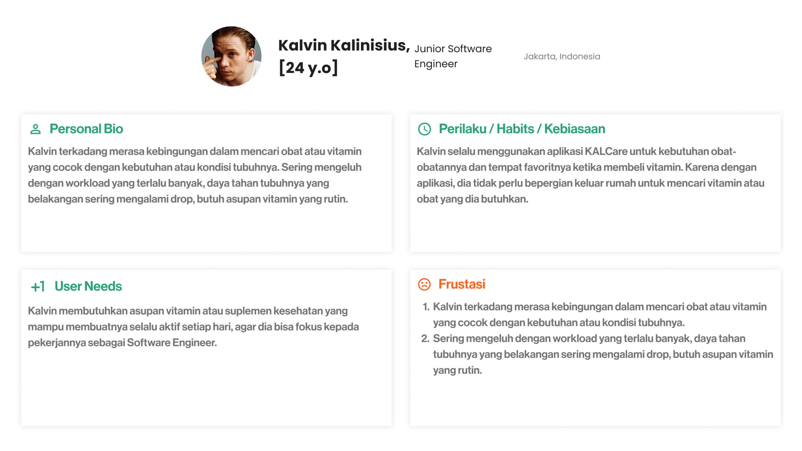
developed a fictional persona to anticipate and understand the future behaviors and needs of potential KALCare users.
Creating High-Fidelity UI Screens
I began by creating wireframes to visualize the layout and structure before moving on to high-fidelity designs. This step allowed me to explore and refine the core concepts early in the design process. Im using Miro Software to create the wireframe, and it tooks approximately 30-45 minutes in concepting phase
WIREFRAME AND USER FLOW OF KALCARE APPS
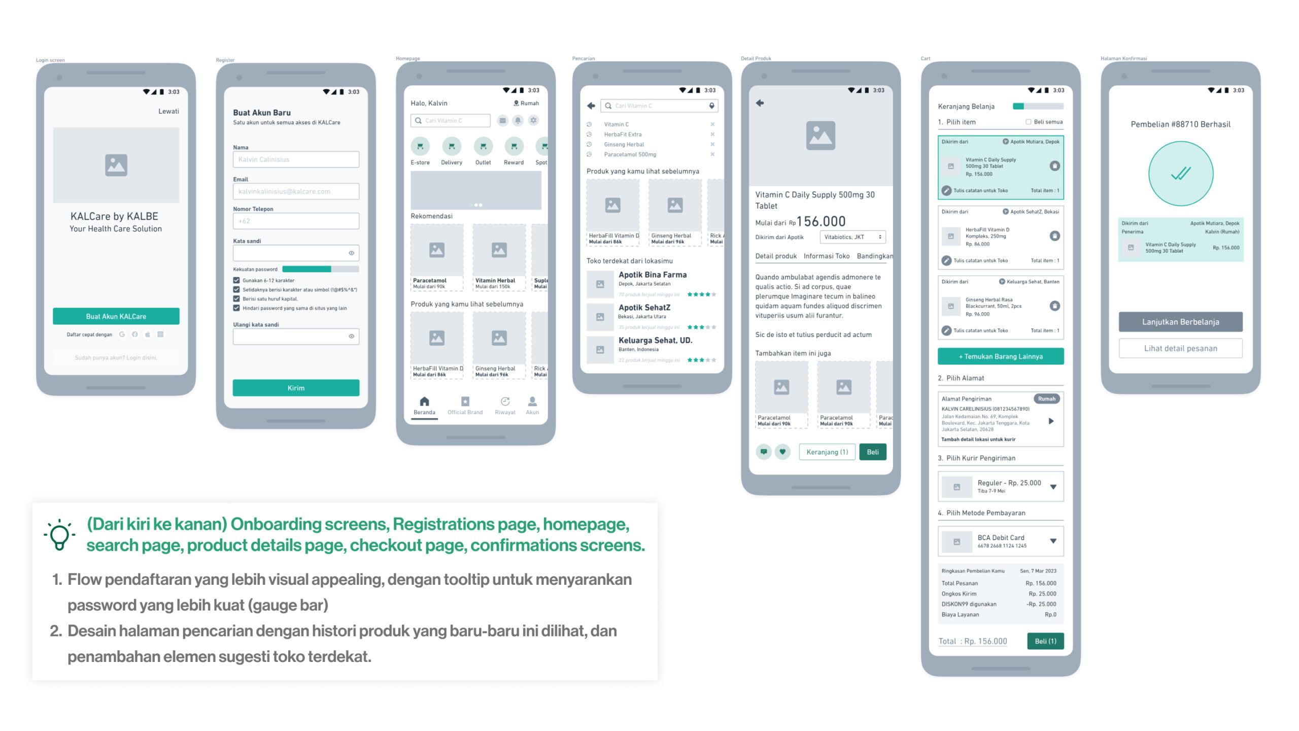
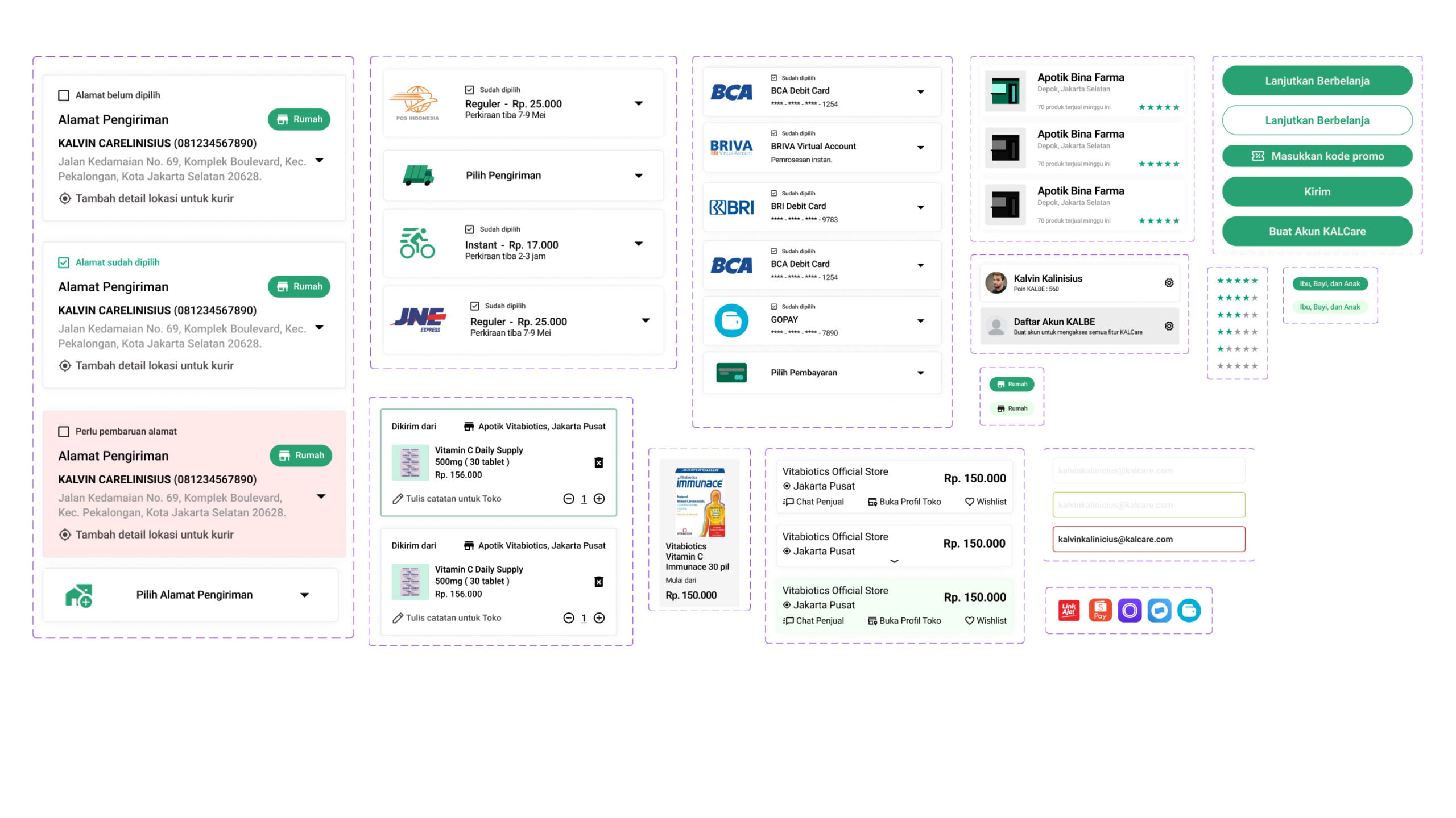
DESIGN SYSTEM AND REUSABLE COMPONENTS
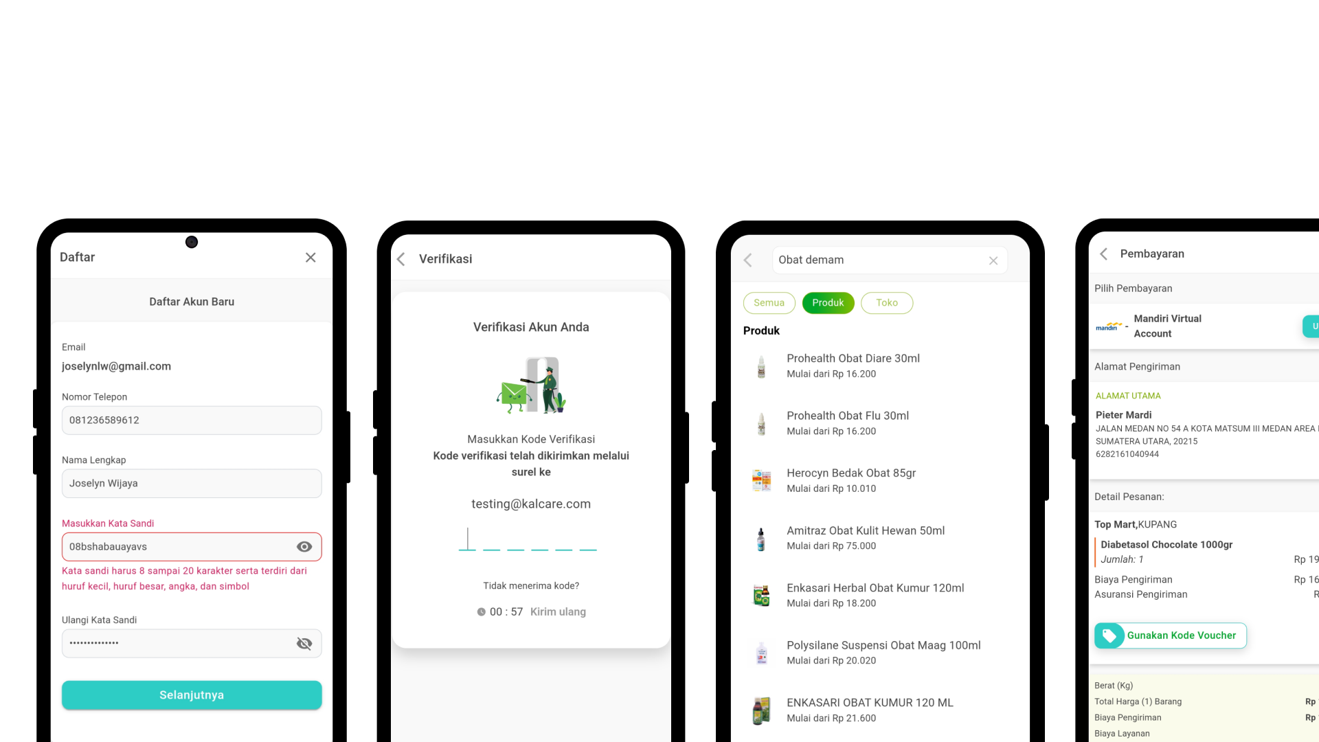
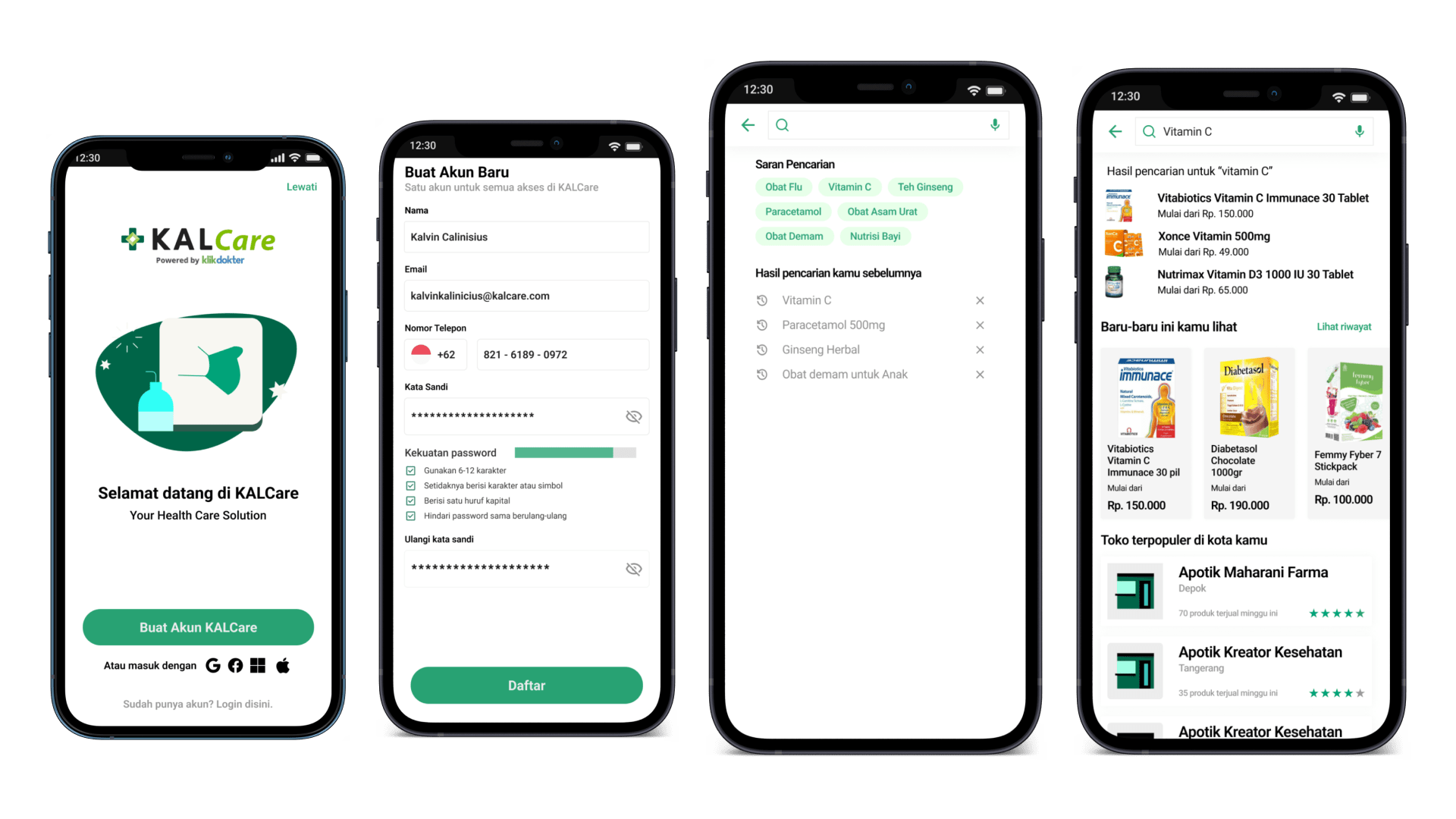
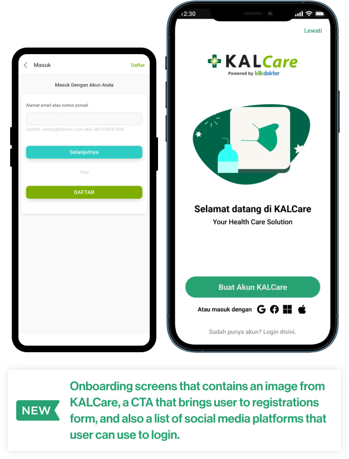
BEFORE AND AFTER IMPROVEMENT
Better onboarding screens
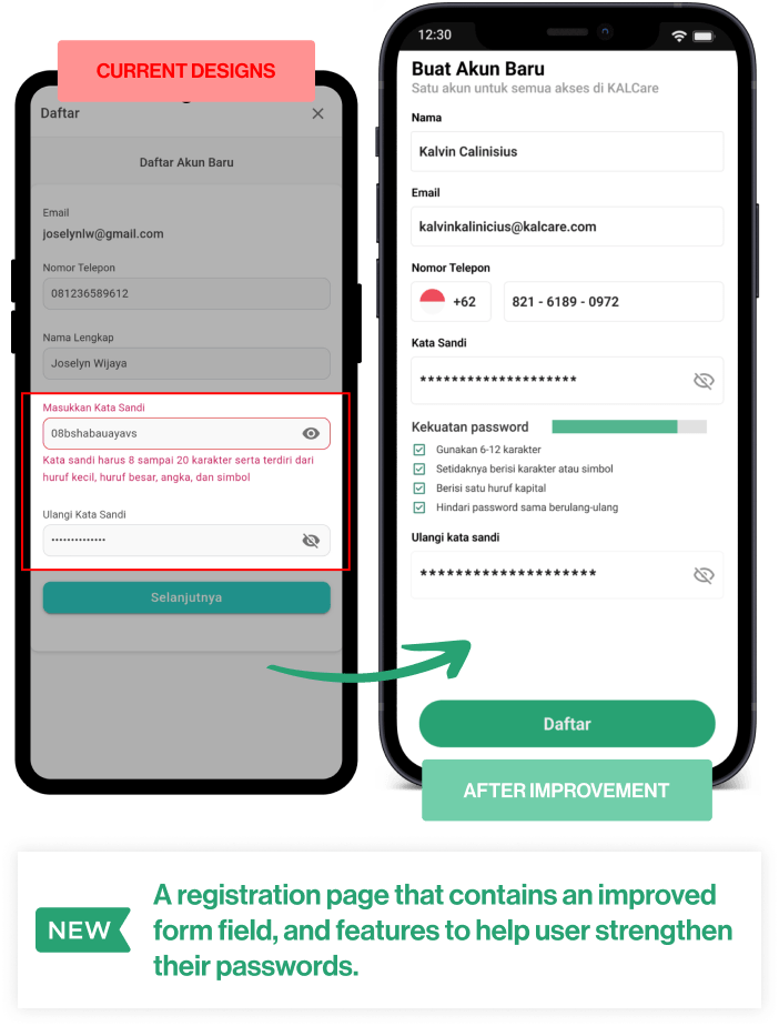
BEFORE AND AFTER IMPROVEMENT
Security measurement to strengthen passsword.
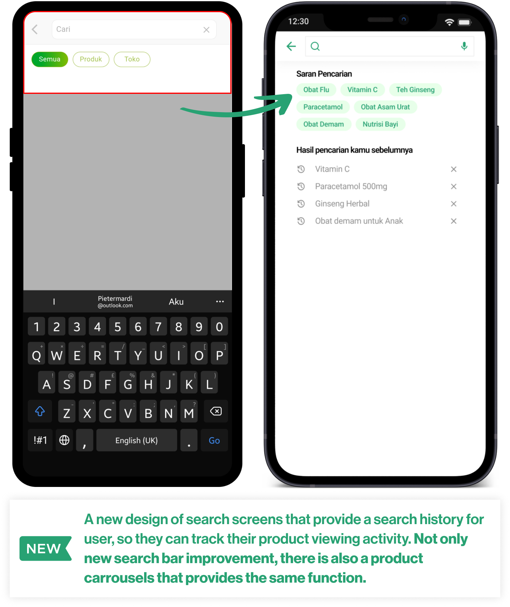
BEFORE AND AFTER IMPROVEMENT
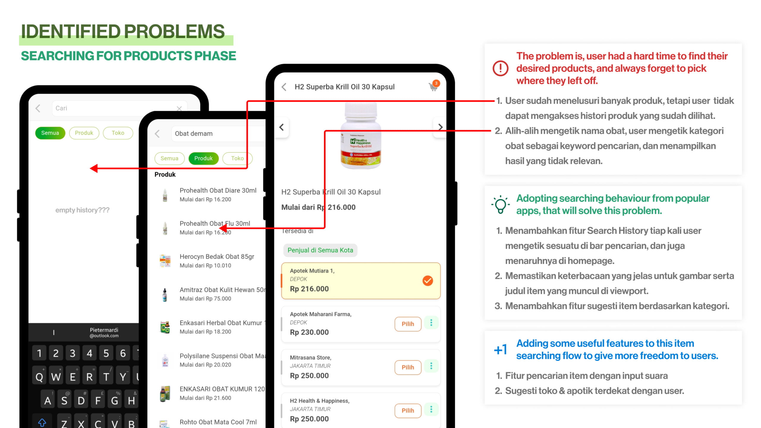
Improving Search History when looking for products
BEFORE AND AFTER IMPROVEMENT
Improving Product Suggestion and Relevance
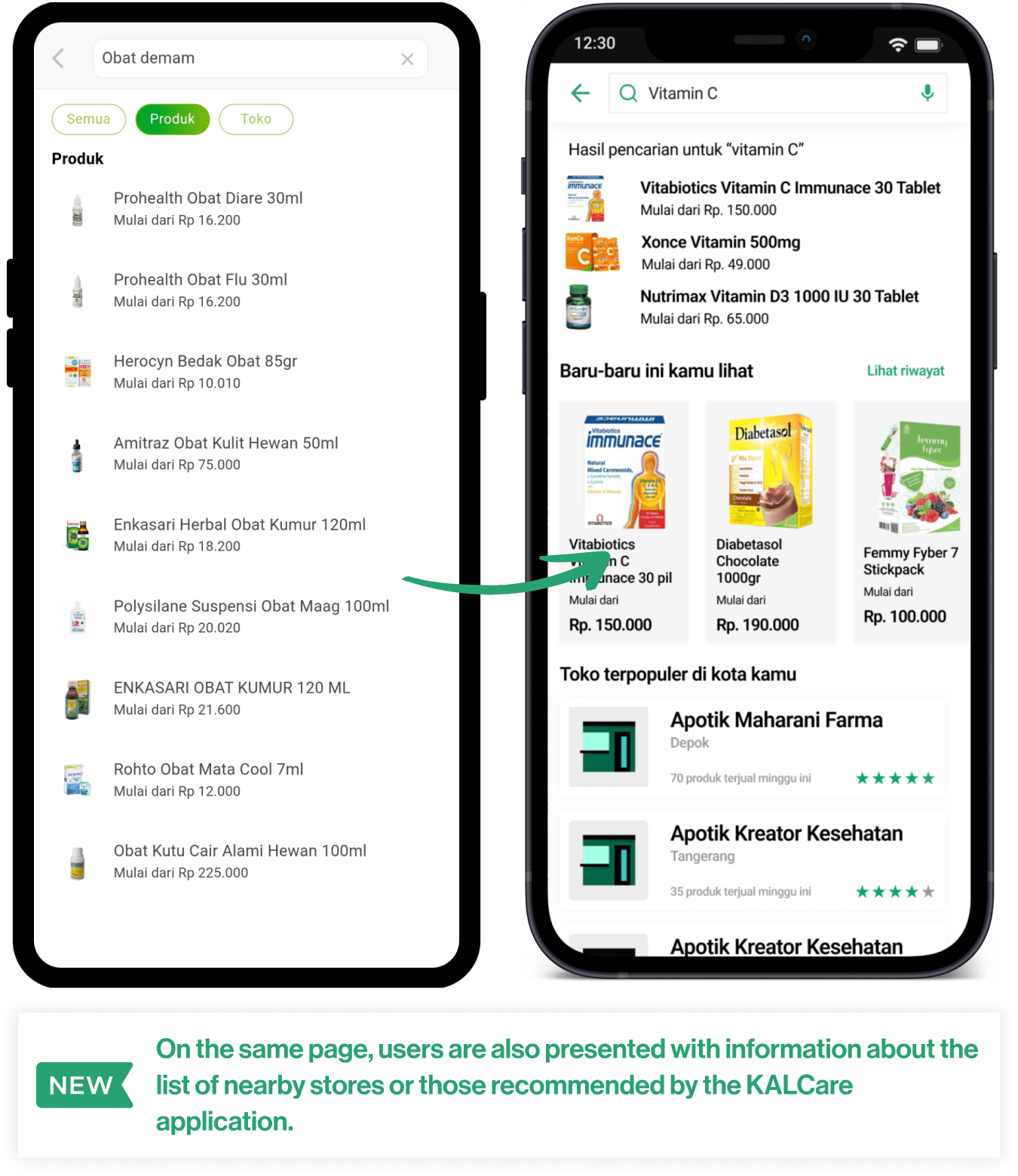
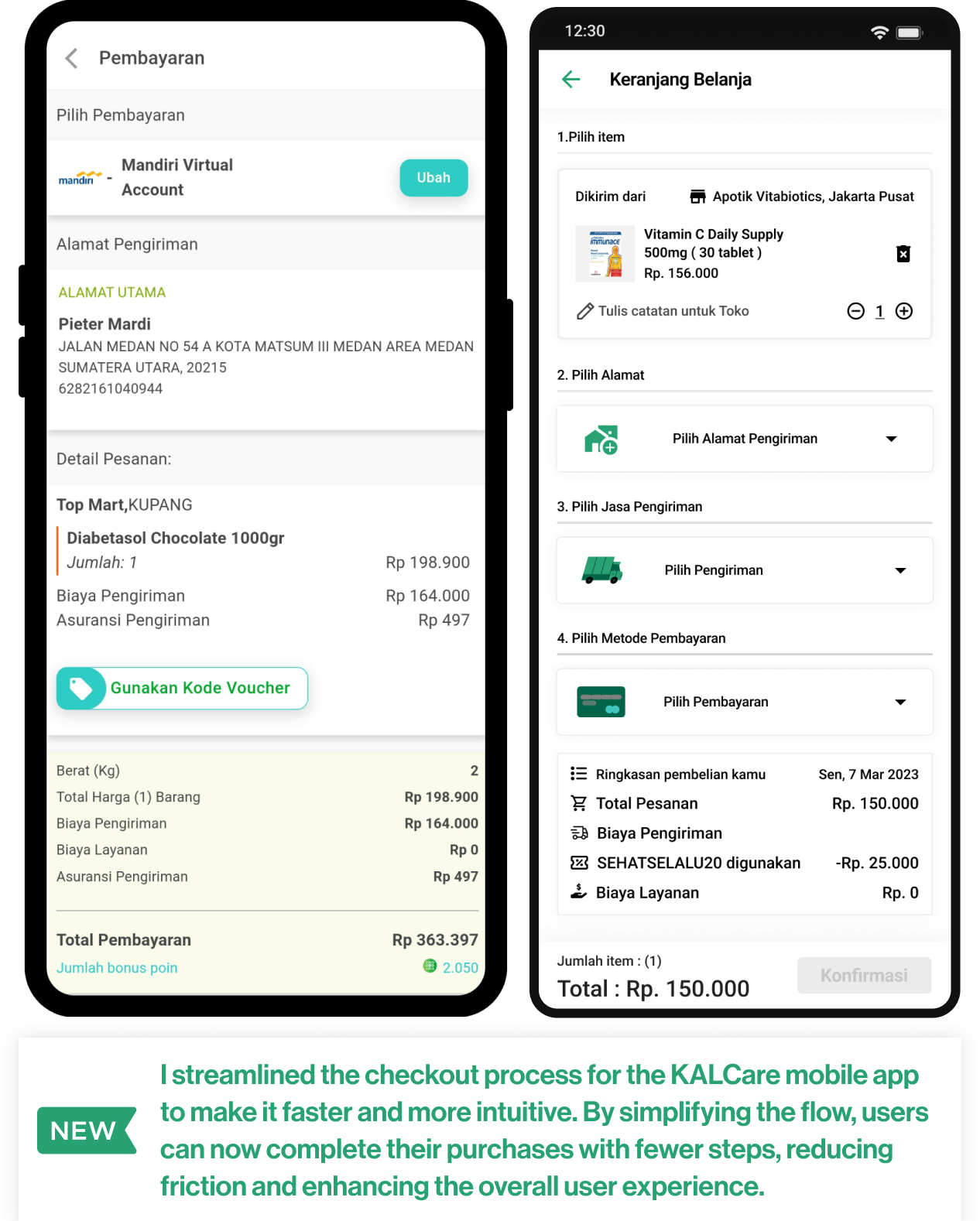
BEFORE AND AFTER IMPROVEMENT
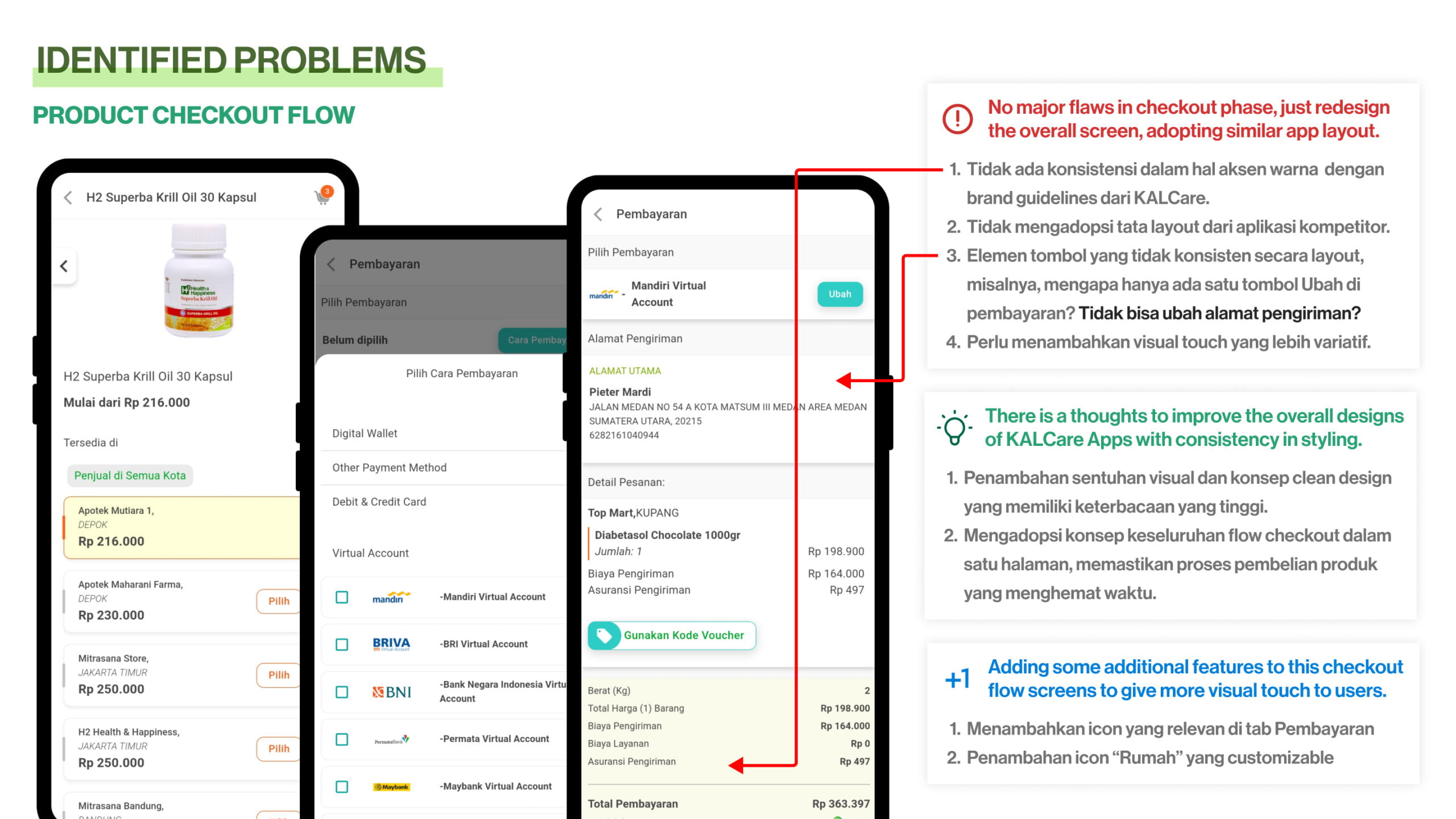
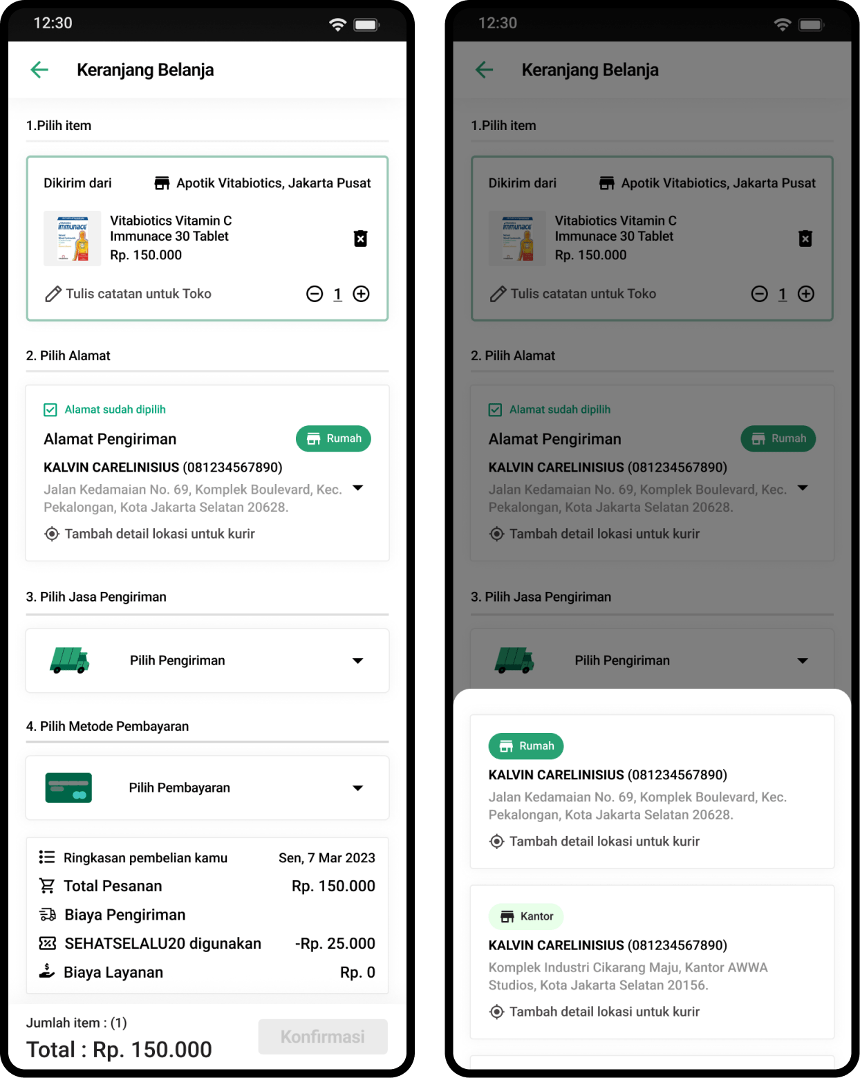
Improving Checkout Flow when finishing transactions.
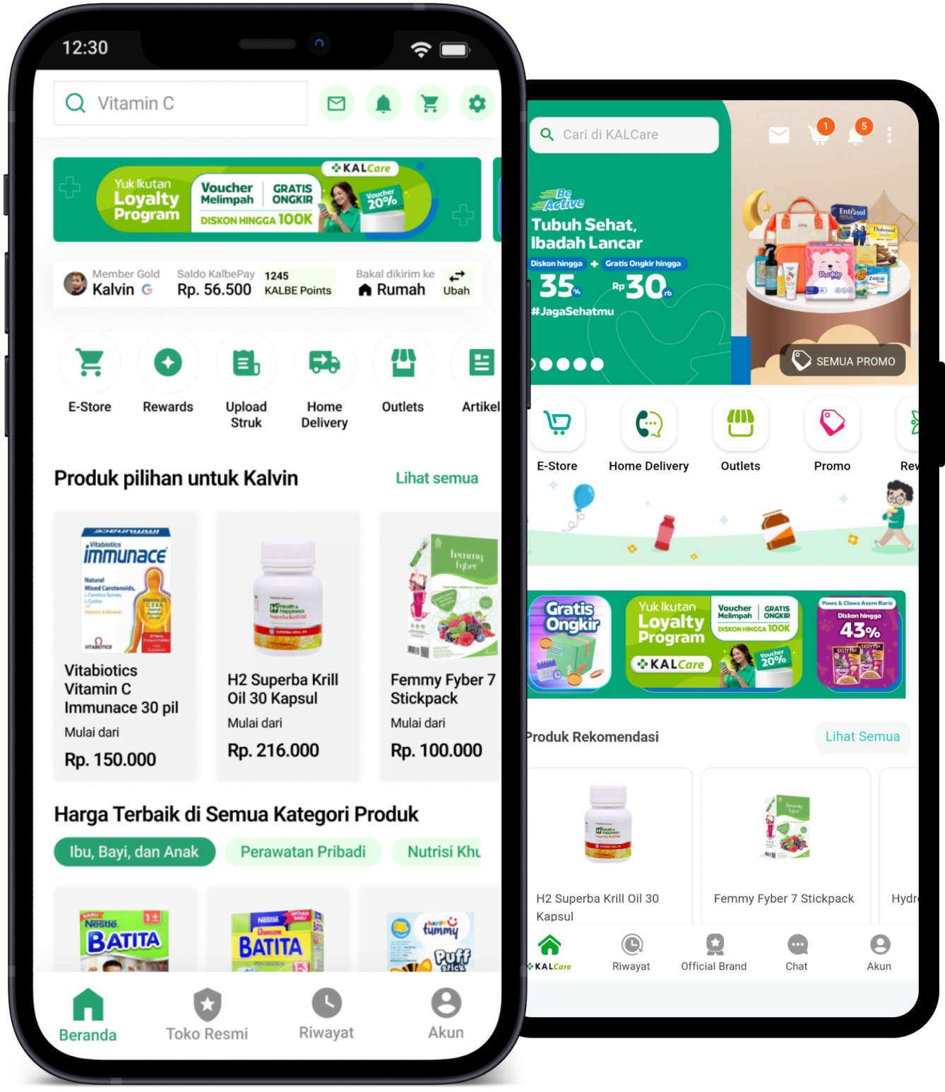
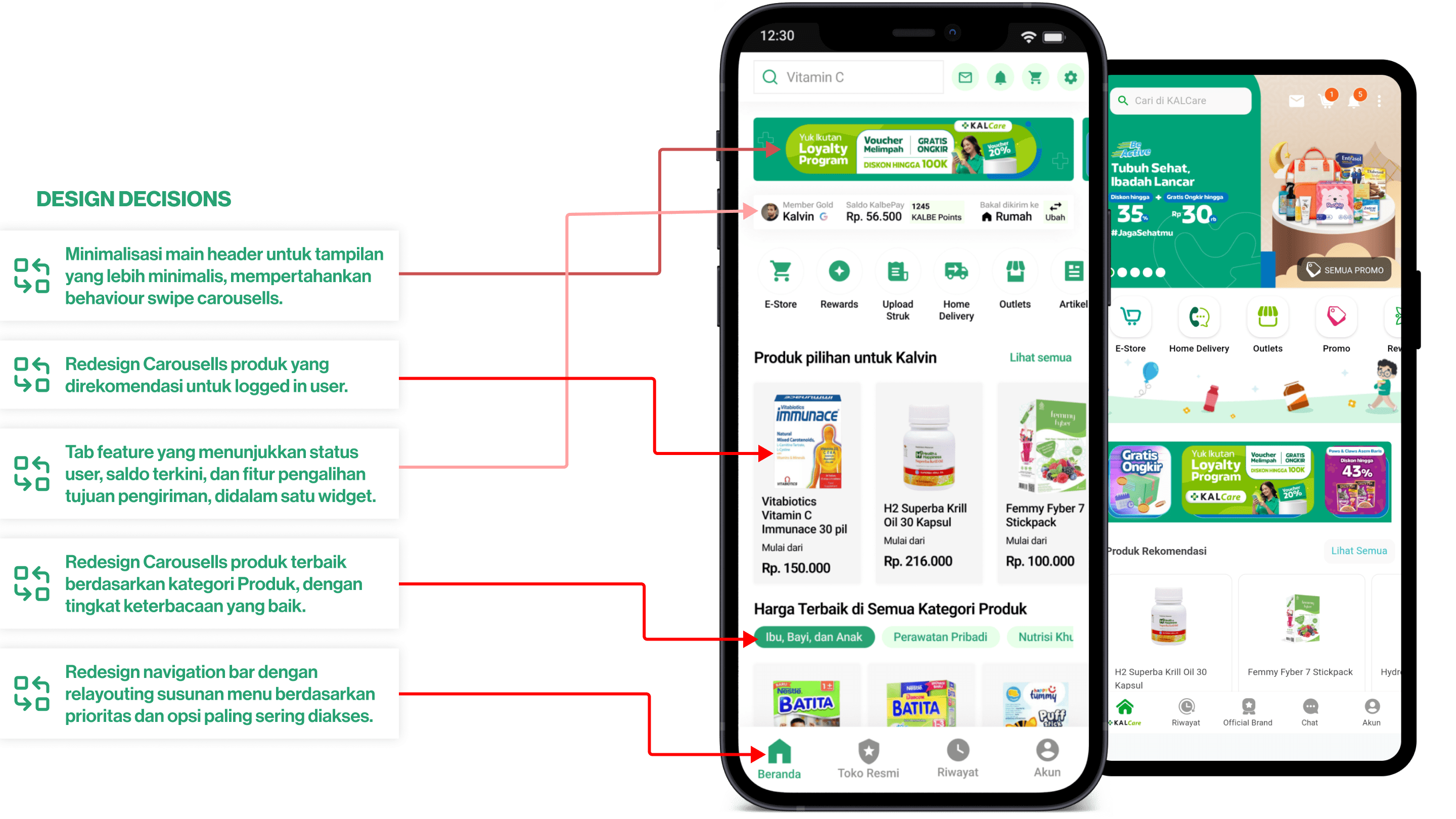
Homepage Revamp. Before and After redesign phase.
Given that this is my first project at Purwadhika Bootcamp, I am eager to contribute further. After resolving issues with the transaction flow and account registration, I believe I can enhance the KalCare homepage by revamping its design for an improved user experience.
REVAMP WITH DESIGN DECISIONS
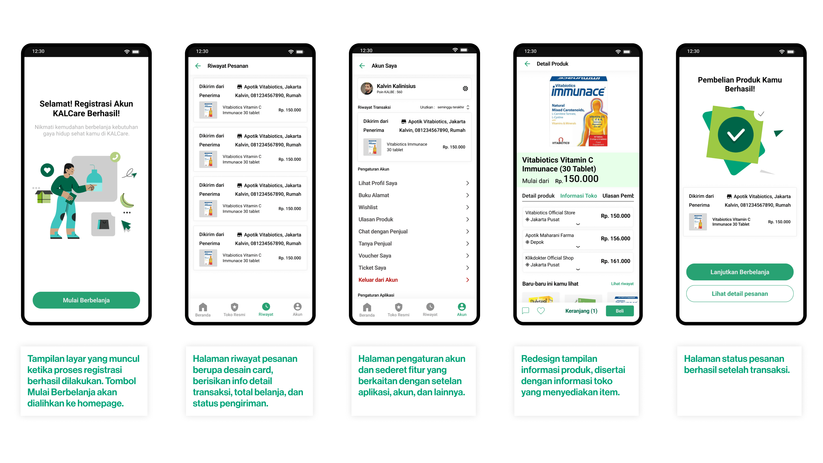
Other refreshed & redesign screens, after revamping phase.
Given that this is my first project at Purwadhika Bootcamp, I am eager to contribute further. After resolving issues with the transaction flow and account registration, I believe I can create and improve other interface to be more intuitive and modern.
FROM LEFT TO RIGHT = SPLASH SCREEN, TRANSACTION LIST, SETTING PAGE, PRODUCT PAGE, SUCCESS TRANSACTION PAGE.
Validate the Design Improvement Prototype through Usability Test.
